By Lilly Buist / Editor-in-chief
There is something to be said about history. A business from another town won’t know it, but in the current town logo, I know that the featured cross at the top of the skyline belongs to the New Palestine United Church.
The proposed New Palestine logo destroys our entire history, including the long-standing red color scheme that has dominated our small town for as long as I’ve known.
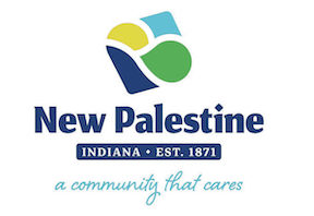
The proposed town logo was released in the Daily Reporter on Oct. 16, featuring an abstract assortment of shapes and colors. At the bottom, a motto reads, “A community that cares.”
Multiple different versions of this logo with slight differences in colors have been released, featuring blue, green, yellow, and orange—nearly every color except for red.
Although the motto accurately describes the supportive New Palestine culture, there is nothing else that can truly resonate with a citizen of our town. While our current logo shows buildings from US-52, the most prominent street in New Palestine, the proposed logo simply has shapes.
In conversations regarding this proposed logo, it has been discussed that NPHS is not the only important aspect of the town; therefore, the logo does not need to have the color red.
In fact, the argument has been made that the color red shouldn’t be part of the logo at all to stress this separation.
While I agree that NPHS is not the only important aspect of our town, its campus is where our community values are always on display. The stands are regularly packed with community members at NPHS sporting events.
As the logo states, our community cares, and this is best seen on the local high school’s campus. It is not a bad thing that our town cares so deeply about our local teams. By removing the color red from the logo, this major connection between New Palestine citizens and NPHS is completely ignored.
Everything in New Palestine is changing, from our town center to our school. Only two of the classrooms I sit in every day existed when I first started attending NPHS. Yes, change is inevitable; as a senior, I am reminded of this every day.
In order for progress to be made, things must change—but what progress does drastically changing our logo make? An update is inevitable; a complete rebrand is more than unnecessary. This logo doesn’t describe our town past the cursive phrasing at the bottom.
Although the structure of our town is changing, our wholesome, supportive community should not. I hope this logo never represents New Palestine—it’s too modern for how our town should be recognized. The abstract shapes do not feel comforting, nor do they remind me of the incredible family I feel like I have in New Palestine.
In the current logo, our values go unsaid. The skyline silhouette gives proper credit to our town’s main street, and the color red represents where our town truly comes together to support each other the most. We don’t need a motto that says, “A community that cares;” anyone from the town knows it, and anyone else can interpret it.
We are not Fishers, or Hamilton Southeastern, or Indianapolis. We are New Palestine—a tight-knit community of hard workers and fierce supporters. Although we are growing, this logo does not accurately represent the current town.
I believe the town should simply update the current logo to better describe the current New Palestine. A black skyline silhouette representing the larger New Palestine area and a modern font, along with other slight changes, would be much better than a complete redesign. New Palestine is still the same town it always has been; acting like it is will never change that.